Wednesday, December 24, 2008
Helvetica
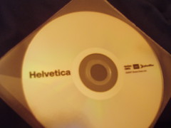
I finally watched the DVD of "Helvetica" yesterday, it was pretty interesting (as well as having a kickin' soundtrack). It's a documentary about the Helvetica font, which was created in 1957 by Max Miedinger and Edüard Hoffmann for the Haas type foundry in Switzerland (the name "Helvetica" is taken from the Latin for Switzerland) and eventually took over the world - at least that's how it appears. The film is filled with images of the signs, posters and notices that fill our everyday lives, with Helvetica being used just about everywhere.
The film features interviews with various font and graphic designers (including the guy who worked on Verdana with Microsoft, Matthew Carter), talking about the history and usage of Helvetica. It was intended to be a neutral font with no intrinsic meaning: a clean, legible and "rational" typeface that could be used in a wide variety of signage. (Although not mentioned in the film, the British "Transport" font - used since the 1960s on all UK roadsigns - was also created in 1957 and shares similar design aims of legibility.)
Some people love Helvetica and some hate it, often for the same reasons. For some it's neutral, a blank canvas onto which a designer can impose his or her vision; for others it's a safe, lazy choice that indicates a lack of imagination and creativity; for others still it's a thing of beauty, the "perfect font". Some even see it as oppressive, almost fascist - the font for faceless corporations and government organisatons - and for them using it is less a design decision and more a political statement (I find that a bit hard to take seriously).
The use of Helvetica really took off in the 1960s, and it was interesting to compare (for example) the adverts for Coca-Cola in the 50s with those in the 60s. One of the commentators in the film observes that the rise of the personal computer - and the use of Helvetica as default in so many publishing packages - is another factor in the continuing ubitiquity of the typeface. Interestingly, the web wasn't really mentioned at all, although arguably that's where a lot of people come into contact with typography these days.
Personally I like how Helvetica looks, but I do think that it's also a bit overused sometimes. I believe that the choice of font can contribute to creating a particular mood about the text - but then, I also feel that the shape of words and paragraphs, and how they look on the page, also creates an impression aside from the actual content. So I enjoyed hearing one interviewee wax lyrical about the letterforms, the shapes "inside" and "between" the letters, and how even the spacing between the letters can change the character of the typeface.
Kyle thinks it's hilarious that I watched an entire film about a font. However if you're into fonts then you might like to try the What Font Are You? game from the PBS website (I came out as "Helvetica", which is "classic", "reliable" but also "slightly boring" - not sure if that's a good thing or not). I saw from the website that the director's next film is "Objectified" and is about industrial design of everyday objects (toothbrushes, iPhones etc). I've read a couple of books like "The Design of Everyday Things" by Donald Norman, and "Small Things Considered" by Henry Petroski and this sounds like it might cover similar ground, so it could be interesting too.
Helvetica film website
[v]ocabulary blog posting about the soundtrack which includes the track listing
Subscribe to:
Post Comments (Atom)


2 comments:
Gah, I'm boring Helvetica too. But at least I'm not comic sans.
I guess I should have mentioned too that the multiple choice answers in the "Which Font Are You" quiz are generally a bit lame.
Post a Comment